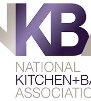
NKBA announces unified brand

It is the first change in NKBA visual branding in eight years and one of the most significant changes in the association’s 53-year history.
The National Kitchen & Bath Association announced Jan. 20 a sleek new visual brand identity unifying all of the association’s key brands with an emphasis on “K” and “B
It is the first change in NKBA visual branding in eight years and one of the most significant changes in the association’s 53-year history.
“NKBA is an indispensable and compelling resource for information, learning opportunities and experiences across all industry member segments,” said Bill Darcy, NKBA CEO. “Our goal with the new visual branding language is to unite all these advantages of NKBA under one modern and contemporary look that will help our members and chapters to stand out.”
The association logo focuses on the NKBA acronym due to its strong brand equity, and includes the full brand name to help increase recognition of non-members.
“We considered several different factors in designing the logos, including our current perceived brand position, logos of other associations and organizations in the design and construction industry, as well as branding trends in terms of color and style and longevity,” said Loren Barrows, NKBA director of marketing who led the rebranding effort.
The new logo will be rolled out during the first half of 2016, including on a new website slated for launch in May.


